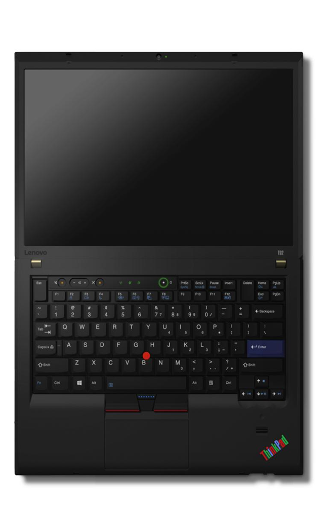
Thinking differently about design
Lenovo design VP David Hill thinks a lot about design. He comes from the same school of thought as F.A.Porshce who said “Change is easy, improvement is far more difficult.”
On his blog at Lenovo he invites fellow ThinkPad afficiendos to join the discussion about a retro inspired ThinkPad stuffed with Modern Tech.
He goes on to say “For a while now I’ve been exploring the idea of introducing a very unique ThinkPad model. Imagine a ThinkPad that embodies all the latest technology advances, however, embraces the original design details in the strongest way possible. I’ve been referring to the concept as retro ThinkPad. Imagine a blue enter key, 7 row classic keyboard, 16:10 aspect ratio screen, multi-color ThinkPad logo, dedicated volume controls, rubberized paint, exposed screws, lots of status LED’s, and more. Think of it like stepping into a time machine and landing in 1992, but armed with today’s technology. Although not for everyone, I’m certain there’s a group of people who would stand in line to purchase such a special ThinkPad model.”
Well you count many of us at GURUS who would love to see this realised.

I for one have been a ThinkPad user for way longer than I wish to admit to – I have always loved the simple functional aesthetics of a portable meant for real work. I currently own three – An all singing all dancing one for everyday work, a tablet as a novelty and an X61 that I just can’t get rid of.
David finishes by inviting feedback “Step with me now into the ThinkPad design time machine. Fasten your seat belt, settle in and share your thinking. Help me understand the retro ThinkPad opportunity, or help me shape the future of all our ThinkPads. If you think Lenovo should make the retro inspired ThinkPad, or have suggestions on how to make it better, please post your comments here. We’re listening.”


