Android Pay launches in the UK

Apple Pay rival Android Pay has launched in the UK, letting any Android users make contactless payments of up to £30.

Android users with a device running KitKat 4.4 and above with NFC will be able to make payments in the same way you can with Apple Pay. The system works with all existing contactless payment points including London transport.

To pay for goods the smartphone needs to be awake and tapped on the contactless reader. For payments over £30 the user has the option to authenticate the payment by unlocking the smartphone.

Transactions use tokenisation to secure payment information. The users credit card details are never sent and all transactions are immediately confirmed to prevent fraud or suspicious activity.

Users can connect a Visa or Matercard credit or debit card to their Android Pay app. Supported banks at launch are Bank of Scotland, First Direct, Halifax, HSBC, Lloyds Bank, M&S Bank, MBNA and Nationwide.

Nasir Ahmed

“It’s suprising that Google has followed the competition in this space rather than led the way. However I’m sure Google will build around their payment ecosystem, Google has already announced Android Pay Day, which will give users special offers on the last Tuesday of the month.”

Over 84m contactless credit cards have been produced in the UK as of February 2016 and over £1.3bn was spent using contactless payments in the month with usage growing by 36% year-on-year.

Why Apple CareKit matters

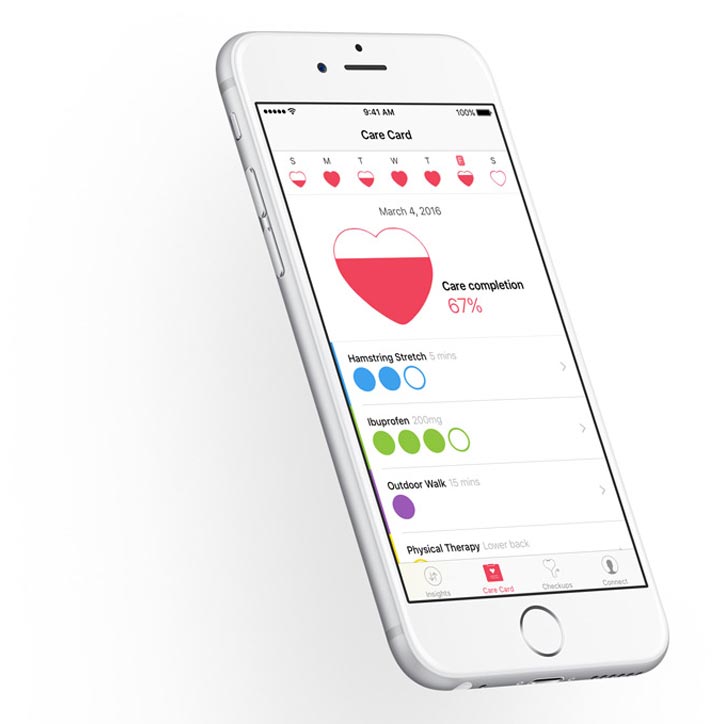
Apple launched CareKit following on from the success of ResearchKit launched in 2015.

ResearchKit focuses on large studies and has proved itself by launching some of the largest research studies in history. CareKit looks to expand into patient care by allowing users to access four initial modules:

  1. Care Card – this helps users track their care plans and action items.
  2. Symptom and Measurement Tracker
  3. Insight Dashboard – maps symptoms against action items.
  4. Connect – Allows user to share information with healthcare providers and familiy members.

Chief Operating Officer Jeff Williams said.

“When we introduced ResearchKit, our goal was simply to improve medical research, and we thought our work was largely done,” he said. “What became clear to us later was the very same tools used to advance medical research can also be used to help people with their care.”

Why does CareKit matter?

By creating apps designed to monitor health conditions, Apple essentially can provide intimate, detailed information on consumer behavior in a way that previously was not available on a large scale. It’s clear that Apple is one of the few major companies that fully grasps the consumerization of health and the benefits to everyone from sharing medical data.

Nasir Ahmed

“GURUS have been working extensively in the healthcare space to provide insights to patients and to better manage their health. Working with Pow Health we have created tools that allow patients to manage, track and share all aspects of their health data.

By Apple entering this market it brings awareness to consumers of the potential benefits health monitoring apps can bring. We hope this awareness triggers more consumers to use Pow Health to better manage their health outcomes.”

Apple has brought mass market appeal to Healthcare tracking and Patient Insights whilst giving healthcare providers valuable tools to provide better insights and care plans to patients.


Apple CareKit


Does Microsoft’s new browser have the Edge?

After 20 years of Internet Explorer – Microsoft sends it into obscurity by launching a cleaner, leaner browser which debuts in Windows 10.

Microsoft hopes the new browser will convince people to come back to Microsoft for their web browsing and put aside negative impressions they may have had with Internet Explorer. The browser is built completely from scratch and the default home page is inviting and fresh.

Microsoft has stripped away the design to leave a very clean “Chrome” like interface. The browser is designed to be touch friendly and icons are where you would expect them to be.

Nasir Ahmed

There’s not much to Edge’s design and that’s a good thing – but can it really regain ground lost to Google’s Chrome?

It’s also worth pointing out that Edge is designed to scale well regardless of the device you are using it on. Our tests have backed this up and scaling is smooth especially with responsive websites.

Microsoft has also further enhanced the Reading List feature which lets you save articles and webpages for later reading. Unlike Apple – Microsoft has continued support for Adobe Flash by building it right into Edge, although we’re not sure why Microsoft continues to support this.

The browser is also Cortana enabled – that doesn’t mean you can talk to it, but Cortana works in the background to provide context when you highlight a word or type in queries for weather or other common search terms.

Microsoft has always set itself apart with its productivity enhancements and Edge benefits greatly with the ability to write on web pages with pen enabled devices (or finger and keyboard) and then share the page with OneNote. Markup is a great idea but it remains to be seen how useful it is in the real world.

Summary:
Our team all think that Edge is more responsive, mobile and touch friendly than the previous versions of Internet Explorer.

For anyone that has written of Internet Explorer in favour of Chrome – we suggest you have another look especially if you are using touch enabled devices. We can’t promise you’ll like it – but you may be swayed..

Thinking differently about design

Lenovo design VP David Hill thinks a lot about design. He comes from the same school of thought as F.A.Porshce who said “Change is easy, improvement is far more difficult.”

On his blog at Lenovo he invites fellow ThinkPad afficiendos to join the discussion about a retro inspired ThinkPad stuffed with Modern Tech.

He goes on to say “For a while now I’ve been exploring the idea of introducing a very unique ThinkPad model. Imagine a ThinkPad that embodies all the latest technology advances, however, embraces the original design details in the strongest way possible. I’ve been referring to the concept as retro ThinkPad. Imagine a blue enter key, 7 row classic keyboard, 16:10 aspect ratio screen, multi-color ThinkPad logo, dedicated volume controls, rubberized paint, exposed screws, lots of status LED’s, and more. Think of it like stepping into a time machine and landing in 1992, but armed with today’s technology. Although not for everyone, I’m certain there’s a group of people who would stand in line to purchase such a special ThinkPad model.”

Well you count many of us at GURUS who would love to see this realised.

Nasir Ahmed

I for one have been a ThinkPad user for way longer than I wish to admit to – I have always loved the simple functional aesthetics of a portable meant for real work. I currently own three – An all singing all dancing one for everyday work, a tablet as a novelty and an X61 that I just can’t get rid of.

David finishes by inviting feedback “Step with me now into the ThinkPad design time machine. Fasten your seat belt, settle in and share your thinking. Help me understand the retro ThinkPad opportunity, or help me shape the future of all our ThinkPads. If you think Lenovo should make the retro inspired ThinkPad, or have suggestions on how to make it better, please post your comments here. We’re listening.”

Join the conversation here

ThinkPad Time Machine

Apple Pay to launch in UK in July

A host of British retailers have jumped on board Apples mobile payments platform including Transport for London, McDonalds, Waitrose, M&S, Boots, Starbucks, Lidl… nothing surprising there really but its the support its getting from the major UK banks and credit cards that is more surprising – Natwest, HSBC, RBS, Nationwide to name a few with the notable exception of Barclays.

The big news is that like existing contactless payment systems – payments will be capped to £20 but will rise along with others to £30 in September. This may change later with Apple having separate agreements directly with retailers and banks.

The system looks to replace the credit card in the contactless payment system with a virtual credit card on your apple device. Retailers will not have to install new payment hardware as the system works with existing contactless payment systems.

Apple Pay also allows payments within apps as well as being supported by some website payment gateways.

Nasir Ahmed

I can’t help but think this is going to impact upon Paypal’s business as consumers may see this as a way of unifying their spending in both the real world and the intraweb.

Apple thinks the system is more secure than the traditional method of revealing your credit card details as it says “Every time you hand over your credit or debit card to pay, your card number and identity are visible. With Apple Pay, instead of using your actual credit and debit card numbers when you add your card, a unique Device Account Number is assigned, encrypted, and securely stored in the Secure Element, a dedicated chip in iPhone, iPad, and Apple Watch. These numbers are never stored on Apple servers. And when you make a purchase, the Device Account Number, along with a transaction-specific dynamic security code, is used to process your payment. So your actual credit or debit card numbers are never shared by Apple with merchants or transmitted with payment.”

Ultimately we think that anyone running an e-commerce site should pay attention and enable Apple Pay as soon as they have support through their Payment Service Provider or as soon they launch a Paypal style checkout button.

Supported UK Payment Service Providers on launch:
Adyen
Braintree
CyberSource
DataCash
FirstData
Global Payments
Judo Payments
Simplify
Stripe
Worldpay

Windows 10 release date set – and its free

Microsoft’s New OS Free to Download From 29 July in the UK.

Yes – its true – Windows 10 will be a free upgrade for users who already have Windows 7 or Windows 8.1. Users will have exactly one year to take advantage of the free upgrade.

The best thing of all is that Microsoft is bringing back the Start Menu in Windows 10. (Yippee!)

Windows 8 didn’t go down well with consumers who struggled with the user experience and Windows 10 aims to put this right.

There’s a host of new features including a new web browser “Microsoft Edge” and a new voice assistant “Cortana” as well as the very best of Windows 7’s usability and Windows 8.1 background features.

All of this aside – the start button’s reappearance will make users feel comfortable again. It’s just a shame they didn’t listen to their users in the first place.

On top of this Microsoft want to help developers develop across its common platform range to create apps that will work across desktop, tablet and mobile devices. Developers can use “Continuum” to allow these apps to adapt to different screen sizes and and sync content between devices.

Microsoft goes a step further by making it easier for developers to port Android or iOS apps to Windows. This will mean your likely to see a better supported Windows Store with more Windows versions of existing iOS and Android apps.

Bing follows Google to reward mobile friendly sites

Following on from Google’s recent announcement that it would reward mobile friendly web sites, Bing has announced that it too will rolling out a mobile friendly algorithm for Bing mobile search results.

Unlike Google’s “Mobilegeddon” statement Bing said it would work closely with webmasters to roll this out with the least amount of impact. Bing is downplaying the impact the change will have saying that it will not hurt relevancy and that even non-mobile friendly pages with high relevancy will still appear high in it search results.

This is what Bing has to say “Our approach to mobile friendliness as a ranking signal balances the need to improve the ranking for mobile-friendly pages, with the continued focus on delivering the most relevant results for a given query. This means that for mobile searches on Bing, you can always expect to see the most relevant results for a search query ranked higher, even if some of them are not mobile-friendly. While the changes will improve ranking for mobile-friendly pages, webpages that are highly relevant to the given query that are not yet mobile-friendly will not get penalized.”

Bing has not tied these changes to a specific date – but like Google, it too will be bringing out a tool that allows webmasters to test websites and analyze the results against its mobile friendliness classifier.

Nasir Ahmed

This was inevitable really and expected but just goes to show how differently the two companies communicate with webmasters. Google effectively lays down the law, while Bing (Microsoft) uses a lighter touch that coaxes the audience into acting. Right or wrong – if your website isn’t mobile friendly then this is just another reason to pull your finger out and do something about it…

Notes: While Google has the lions share of the search market globally – Bing does account for 14% of searches in the US.

European Plans for a Single Digital Market

The European Commission unveiled its detailed plans to create a Digital Single Market, thereby delivering on one of its top priorities.

The plan is based around three pillars:

  1. Better access for consumers and businesses to digital goods and services across Europe.
  2. Creating the right conditions and a level playing field for digital networks and innovative services to flourish.
  3. Maximising the growth potential of the digital economy.

Under the first pillar there will be changes in the handling of VAT and cross-border shopping rules and steps to reduce geo-blocking of websites, shipping costs and inconsistencies in consumer rights enforcement.

Nasir Ahmed

Geo-blocking can be a useful tool when applied correctly to direct users to specific sites with localized content. What the EU wants to do here is make a stand for consumer rights by ending discriminatory practices used for commercial reasons, such as when online sellers either deny consumers access to a website based on their location, or re-route them to a local store with different prices. Such blocking means that, for example, car rental customers in one particular Member State may end up paying more for an identical car rental in the same destination.

Pillar two will be addressed by talking directly to stakeholders like Google and Amazon and will be achieved by overhauling telecoms rules and incentives for investment. The policy also looks to define priorities for standards and interoperability in areas critical to the Digital Single Market, such as e-health, transport planning or energy (smart metering).

The third pillar addresses the need to boost skills and standards and talks about a European Cloud initiative.

What the EU is saying:
“At present, barriers online mean citizens miss out on goods and services: only 15% shop online from another EU country; Internet companies and start-ups cannot take full advantage of growth opportunities online: only 7% of SMEs sell cross-border (see Factsheet for more figures). Finally, businesses and governments are not fully benefitting from digital tools. The aim of the Digital Single Market is to tear down regulatory walls and finally move from 28 national markets to a single one. A fully functional Digital Single Market could contribute €415 billion per year to our economy and create hundreds of thousands of new jobs.”

Misconceptions about web development

In the early days of the late nineties and the noughties we sometimes struggled to get our clients to fully understand the process which they were embarking on – we invested a lot of energy on compiling process documents that fully explained what each party had to bring to the table to launch which in many cases was the companies first online expedition. People everywhere were playing catch up.

During our time we’ve worked at all levels of corporate hierarchy – from group companies and the board of directors to the marketing, sales and IT departments.

Move forward 10-15 years and everyone has become internet savvy but a lot of decision makers and CEO’s still make the same misconceived assumptions.

1. Website development is easy
People underestimate the work involved in creating a website. Well known websites such as facebook look simple but there are lots of complicated development and infrastructure requirements that are time consuming.

Simplicity is sometimes harder and more expensive to achieve as it involves a deeper and more focused understanding of a users interaction with the site.A lot of people still don’t fully grasp the work required and the resources required to create a website that is meaningful and part of a companies DNA.

We work hard to make sure that everyone we work with is as committed as we are to creating the best possible solution and making sure that stake holders feel involved and part of the process – but rest assured – there are no miracles here.

2. It’s your project so you can dictate the design

Design is a deeply personal thing, a bit like a persons sense of fashion or lack their of. Nowadays we live in a world where people access a website across a plethora of desktop clients and devices – this makes design decisions even more important as they must be able to respond responsively (or indeed adaptive) to a users device.

Designers will understand the vision and work with the development team to make sure this results in a cohesive interface that helps visitors access information or convert into customers.

Any reputable agency would have considered lots of options before presenting the user interface to the client and many of these decisions would be backed up by experience and usability testing.

3.Everyone should be involved

The old saying “too many cooks spoil the broth” is even truer when it comes to a website or mobile app. Everyone has their own view or wants a feature they’ve seen on another site.

The reason to employ an agency as opposed to leading the project yourself and working with freelancers is your buying into a team who is looking at the complete picture on your behalf.

At GURUS: we always recommend having a small team of stake holders who are responsible for the content strategy, business objectives and user interaction.  Working in this manner we can ensure budgets and timelines are adhered to without scope creep adversely impacting the project

4.Once a website is built its done

This is my favourite – whereas its always good to have delivered a project on time and within budget its always invariably just the first phase in a journey that consists of maintaining and monitoring the site.

All websites should constantly be updated against security threats and glitches. New content should be generated for SEO purposes and existing content and products should be maintained.

The web constantly involves so a regular review of a website is essential to keep the website healthy and moving in the right direction.

Google ups the stakes on mobile-friendliness

Google updated its algorithms today to take into account a sites mobile-friendliness. What this actually means is that sites that fail googles mobile-friendliness tests will appear less in search results and may not appear at all on searches initiated from mobile devices. We have learnt however that this change does not affect tablets or iPads.

You could be forgiven into thinking that a company with arguably the biggest billboard in history and the ability to take you on a virtual walk through around the globe would have tried a little harder to communicate what this means to small business’ whose websites are not mobile friendly.

Nasir Ahmed

Whereas we love the way that Google can accelerate changes across the internet – we’re not so happy as to how Google has managed this change. It’s just another reminder of how colossal Google has become.

“We will be expanding our use of mobile-friendliness as a ranking signal. This change will affect mobile searches in all languages worldwide and will have a significant impact in our search results,” Googlers Takaki Makino, Chaesang Jung and Doantam Phan said in a blog post announcing the change back in February.

Companies ill prepared for one of the biggest changes in Google’s search algorithm for three years can lose valuable ground in the ever changing impact that Google’s search can have on a business success or failure. For the user the changes can ultimately demote important legitimate websites that you may no longer have access to.

Newer websites benefit from being built responsively or adaptively and this change just goes to show how investing in the right technologies at the right time pays dividends. However larger more complex websites built over many years find it much more difficult to respond so quickly.

At GURUS our mantra has always been to separate the business logic from the presentation layer but even then we find some of our customers have had to make tough decisions and think long and hard about either updating their website to be mobile friendly or creating a new device specific site to deal with mobile devices.

There’s no right answer – and you have to consider the financial costs as well as the business impact and loss of valuable SEO rankings in the interim.

The update does however improve the user experience by eliminating websites from the search that do not render well on the initiating device – so in this way google is “pushing” its vision of how the web should be and its hard not to agree with it.

With over 50%  of searches now happening on mobile devices – maybe its a wake up call that you can’t rest on your laurels in a digital world.